Pokémon Data Story
Telling a story with my Pokémon Data
Project up to this point
Introduction
I love Pokémon, I have ever since I was little watching the television show with my older siblings. Another thing that I find interesting is the study of gener and how that impacts how we see the world. I decided to combine these two by exploring the difference in percentage of males for Pokémon, specifically by type.
Data gathering and cleaning
I found a website with different Pokémon datasets, mainly from Kaggle that had so much different measurements on so many Pokémon. I decided to pick a couple of datasets that fit my needs, which included percentage of males per Pokémon as well as type, weight, height, HP, and more.
I put the data together into a single dataset using Pandas and cleaned up the data by making sure there wasn’t any Pokémon that were not included in all of the initial datasets. Because of this, I decided to look at only the first 5 generations of Pokémon.
Exploratory data analysis
Once the data was clean, I was able to do some exploratory data analysis, basically making graphs that showed different things. I wanted to use the same colors that PokémonGo does, so I looked and found this Github repository which had all the different colors for each Pokémon type, which I ended up using to grpah by type. I primarily used Plotly Express, which I really enjoyed. It was fun to see certain patterns in the data, especially how the types differed from each other.
If you want more information about my entire project, feel free to check out some of the earlier posts on my data blog.
My data story
When I started this project, I wanted to explore how the percentage of males differs per Pokémon and how that relates to the height, weight, and HP of a Pokémon. After looking at that, there didn’t seem to be anything super interesting when looking at those measurements, so I decided instead to focus onI wanted to see if the percentage of males per Pokémon changed depending on the type. More specifically if different Pokémon types have different percentage of males compared to other types and which types were the most commonly male or female.
Looking at the below boxplot, you can see that the different types of Pokémon does change the percentage of males that we see, especially when you look at Fighting and Rock type Pokémon. As you can see, there are no Pokémon of those types that have the percentage of males less than 50%, meaning that the highest percentage of females in either of those two groups is 50%.
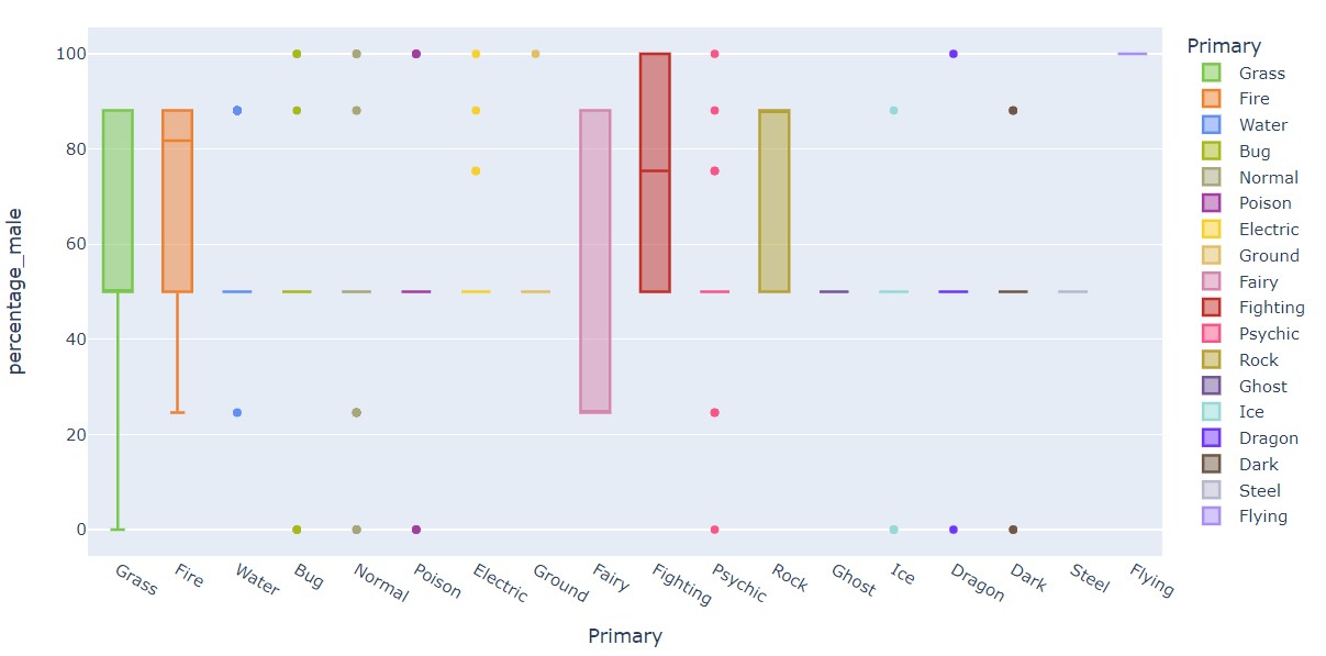
Looking at this graph, most of the different Pokémon types are centered around 50%, which is what we would expect to see, but there are several graphs that have a higher proportion of males as opposed to females. This means that, in general, there are more males than females throughout all the Pokémon overall, even though there are some specific Pokémon that are predominantly female.
Something else that surprised me was how the proportion of fairy type Pokémon wasn’t as predominantly female as I would have expected. Though there is a higher percentage of fairy type Pokémon that have a higher proportion of females than males compared to all the other types.
One thing I do wonder is if the proportion of males would change depending on the secondary type per Pokémon. I decided to erase that column in the dataset since not all Pokémon had secondary types and I wasn’t sure how to incorporate it into my EDA, but I think it would be interesting to look at more in depth.
Conclusion
I had so much fun exploring this Pokémon dataset. It made me realize that this is something that I enjoy and helped me feel excited about being a data scientist. Even though there is a lot to learn, I am excited to continue my journey, and I am definitely planning on playing around with this data some more!
I also made an app using Streamlit with this Pokémon data if you want to check it out and make your own scatter plots.
Here is my Github repository where I kept the code for this project.